 Fridays with Vicky 47
The other day I was approached by a company wanting to test out my ad placements on one of my other sites.
They have an average of 141% upswing with ad revenue. Pretty impressive.
What they do is they test different themes, layouts and ad placements.
It all sounds great and Ezoic, a certified Google Adsense partner, does sound like a legit good program.
At this point I`m not willing to hand over the site BUT it did spark an interest to play around with the ad placement myself.
Can I double the Adsense revenue myself? That would be very interesting (and good for my wallet)
The goal with this on going case study is to take my earnings from $630 monthly to $1260 monthly.
How long will it take? Not sure and time is not really my focus. I rather be doing things slowly so that I can measure the changes, to make sure they are sustainable.
There is always the balance between ads and looks. I have always gone for the look, I never wanted the ads to take over my site. I want the content to be in focus. I`m still not willing to compromise on that. So can I keep the look and still increase revenue? That`s what I`m hoping for.
We will take a closer look at the site. I will show you some numbers of where the site is today September 22, 2015.
After a month I will add an update to see if the change of ad placement incresed the revenue.
The things we will keep an eye on in this case study are:
- Revenue – can we over time double the Adsense income, by just playing around with the ad placement?
- Traffic – will ad placement affect our traffic numbers?
- Bounce rate – will people click away sooner if they are met by an ad?
Let`s dive in.
Ad Placement Case Study – Revenue vs. Beauty Or Can You Get Both?
Last Years Numbers
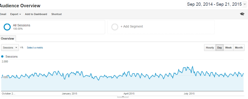
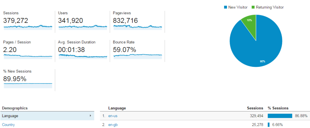
So this site has been pretty consistent in traffic for the last year.


I will average out the yearly numbers.
- Page views – Avg. 69.393 page views / month
- Users – Avg. 28.493 users / month
- Session duration – 1.38 avg. session duration
- Bounce rate 59%
Other interesting data for ad placement is what device is used to visit the site.
In this case 56% use a mobile device, great to know so we can adjust our ads to that in the future.
- Mobile 56%
- Desktop 37%
- Tablet 7%
My Current Ad Placement
In most cases I stay away from adding ads to the top of my posts. I don`t find it appealing. I usually post 1 ad in the middle section 250 x 250 text ad block and a small text banner at the bottom.
No sidebar ads or banners.
With those ads, this has been the result from the last year.

This site made me $7555 from just Adsense this last year.
My best day was $56.22
Avg. $629.6 monthly
Avg. $20.7 daily
I will not go into CTR and other stats against the Google Adsense rules.
The Ad Placement Change
So today, September 22, 2015, I will move the bottom ad up to the top of the site and see what it does with the user interaction on the site, the revenue but also the rankings off site, will it affect them?
The only thing I will do the first month is to move the bottom banner up to the top of my blog posts. I will use the responsive ad unit. Hopefully this will not interfere with the look of the site much.
To make things easy I use a plugin called Quick Adsense that will display ads for me on all my posts.
At top of the posts I will place a responsive, text ads only ad.
Let`s give it a month and we will look at the result.
Numbers for September 22 – October 22

Fast forward a month and this is the outcome, the numbers after the changes we did above.
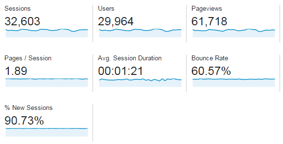
Last month 61.718 vs. avg. 69.393 page views / month – the page views did go down a little bit compared to last years numbers. Is this because people click the ads? It is possible.
Last month 29.964 vs. avg. 28.493 users / month – the user number is up by over a thousand from last year`s avarage so that`s a good sign.
Last month 1.21 avg. session duration vs. 1.38 avg. session duration – it`s down a little bit but that goes hand in hand with lower page views, this low drop does not concern me too much.
Last month 60.57 vs. Bounce rate 59% – just a little higher and that can be due to the ad placement.
 Looking at the numbers I feel pretty good about them, there are no larger disruptions even though we moved the ad placement to the top of the posts.
This is a good sign that my visitors have not found the ad placement too disturbing or annoying.
Let`s see if the revenue has changed.
Revenue for September 22 – October 22
September – October Adsense Income for this site:
Monthly $783.47 vs. avg. last year $629.6 – That`s a 153.87 increase with just that little change that we did.
Daily avg. $25.27 vs. $20.7 last year.
Best day $47.17 vs. $56.22 – Did not “beat” the best day income, but that`s ok, we will lol.
I`m happy about the increase in revenue and will let the changes be “as is” for another month.
Going Forward This Is What We Will Do
Things that we will be doing going forward with this case study are:
- Connect Google Adsense with Google Analytics to get an easier overview of the stats
- Play with text vs. image ads
- Ad size
- More ad placements
- Change to responsive ad units
- Mobile ad placements
I hope you found this article – Ad Placement Case Study – Money vs. Beauty Or Can You Get Both? – helpful.
What`s your thoughts and tips on increasing Adsense revenue? Is there any testing you would like me to do? I would love to hear from you in the comment section below,
Have a productive day,


Vicky,
I just moved my top add down this month to see if that makes a difference. I do think add placement makes a difference, it will depend on the website also as some are better at reader engagement than others.
I just have one at the middle and bottom of my site for this month to see if it makes any difference. I do not have hardly any traffic compared to your site. Thanks for sharing your findings. Are you going to do another test of this kind.
John
Hi John,
That`s the best way to do it, to play around and see what works best on your own site.
Yes I plan on doing more tests like this and share them here on my site.
Thanks for your comment John,
Vicky
I love love love this post. I’m very much interested in it. I already had connected the Adsense with the analytics and am trying to figure out this. I was planning that my next website would be more this. You explained it really well. I added this to my favs and AM coming back to it for reference
Great post. Thank you
Glad you liked it Fatima,
Feel free to come back anytime you want :).
Vicky
Hi Vicky, I am in awe! Your thorough understanding and analysis of ad placement is really impressive. I haven’t even looked into adsense, I guess because some of the training I’ve seen says not to bother, I never did. After reading your post and seeing that you are making money, perhaps it’s something I should look into. I guess because I don’t like seeing ads on sites, I’m very reluctant to make mine appear like a sales pitch. I know it’s all in how you do it, how many, relevance… but I never want people to feel I’m only out to make money. Any suggestions?
Thanks Hindy,
Like you say it`s all about how you present the ads. It can be done in a tasteful and helpful way to your visitors.
You never want the ads to take over or feel overwhelming…
All sites are not made for ads either. This is something you have to test on your own site.
Some sites does very well with ads. Some sites well, there are no point of having them on there because they don`t convert. This is something you have to test to find out though.
It`s also a numbers game, for ads to be worth it you do need some decent traffic.
The great thing with Adsense is that they are custom made to your visitor. So what you see is not necessarily what your visitors see.
They take in many factors when they display the ads on your site. Searches, website visits and lots more.
I would say if you have some decent traffic start displaying one or two ads on posts and pages that are not related to affiliate sales.
Testing is the best way to find out what works on your site.
Hope that helps,
Vicky