Fridays with Vicky 24
Making sure your WordPress blog or site is user friendly is very important.
You want your visitors to stay.
That first impression, when they land on your blog will be super important.
You only have a few seconds to give a good impression, which will decide if the visitor will stay or continue on to another site.
What we will be talking about in this article are some tips and tricks that you can think of when getting your site ready for visitors. So when they do show up they will get a great impression of your site and a great user experience.
10 Things to DO to Make Your WordPress Blog User Friendly
1. Use a Simple Clean WordPress Theme
When choosing a WordPress theme there are thousands to choose between. It is a jungle of WordPress themes. You want to find a theme that has a simple clean look. A theme that has the column count that you want. A theme that represent what it is that you are doing on your site. Are you doing a magazine style blog? Are you doing a video archive? What ever it is you want to do make sure your WordPress theme supports it.
There are many free good WordPress themes to use but on this site I use a premium WordPress theme you can read more about that here.
2. Make Sure the Website Load Time Is Good
A lot of times less is more. Flashy, interactive images and multiple slideshows can take some time to load. You only have a few seconds before the visitor will click away if the site does not load. Load time is important.
One way to check your load time is to use a free service like:
You can also install a wp plugin on your blog and check what eats up your load time.
One that I use is P3 Plugin Performance Profiler.
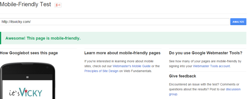
3. Make Your Blog Mobile Friendly
Make sure your WordPress blog is mobile friendly. The reason being is that more and more people visit your blog from their phone, iPad or other mobile device. You want to make sure they get a great experience.
You can check here if your site is mobile friendly.

4. Make The Purpose of the Blog Obvious
Can your visitor tell what your site is about within a few seconds?
The message of your site and what your site is about should be very clear. If the visitor gets confused or do not see directly what it`s about they might leave.
If you are using a header image make sure it`s highly relevant to your site.
5. Keep Things Simple, Don`t Clutter
Filling the sidebar with moving ads and irrelevant offers will not work well. If you have a site about dog food, don`t promote a make money program. Stay relevant, keep things simple and don`t clutter your site.
6. Use Easy Menus to Navigate
Make the menus easy to navigate. Add a home button to your main menu so that your visitor can always find their way back if they would like to.
7. Use Black Text on White Background
There`s a reason why most blogs and websites use black text on white background.
It works! It`s easy on the eyes, it`s easy to read.
I have seen some horror examples with all kinds of odd backgrounds, don`t do it. Sure if you want to point something out making a small part of the page be another color might work. Over all use what works.
There are a few exceptions, one would be if you run a photo display site, the pictures might ”pop” with a black background but for most black text on white background is best.
8. Use a Readable Font
You want your visitors to be able to easily read your content. Make sure you use a large enough font to make it easy on the eyes. You also want to use a font style, like Arial, that is plain and easy to read.
9. Do Use White Space
If your content is airy and a good size font, it will be easy to read. You want to use plenty of paragraphs to break up the text. It`s a lot easier to read smaller paragraphs than a big block of text.
It is also helpful if you use H2 and H3 headers through out the content. Many visitors will be ”skim readers” they will float over the text until they find something that interest them. Make it easy for them to find what they are looking for.
Don`t fear the white space.
10. Do Give Your Visitor a Choice
Don`t have music or video starting automatically. You don`t know in what setting they are browsing your site and it might be disturbing with a sound to come on automatically. Give them the choice to start the music or video themselves, if that`s offered on your site.
Have Somebody Review Your Site
 The best thing to do when you have your site set up the way you want it, is to ask for some feedback.
Have somebody else review your site. Ask them how their user experience was, what they thought was good and what needs to be improved. Then it`s of course up to you what you do with the feedback.
I have found a great place where people discuss blogs and websites 24/7. They have sections for website feedback, they have trainings and support. Feel free to check out my review – My #1 Free Way to Make Money Online. A great community with awesome members that enjoys talking websites.
Hope you found this 10 Things to DO to Make Your WordPress Blog User Friendly blog helpful. What`s your tips and tricks to make a blog or website user friendly? Feel free to share in the comment section below.
Have a productive day,
Vicky


Hey great article and I was wondering about point #5 if you are using adsense is there a way to control what is shown to people or is it just whatever google wants to show? I ask this because that could be ads that are irrelevant to a site’s content.
Hi Derek,
There are many factors that Google look at when placing Goolge Adsense ads on a site.
The site content but also the search history of the visitor. The ads are also based on what other sites you visit, the apps on your device, cookies on your browser and much more.
They will not just through up any ad, it will be relevant to the site content or the visitor in some way.
You can read more about Google Adsense here.
Vicky